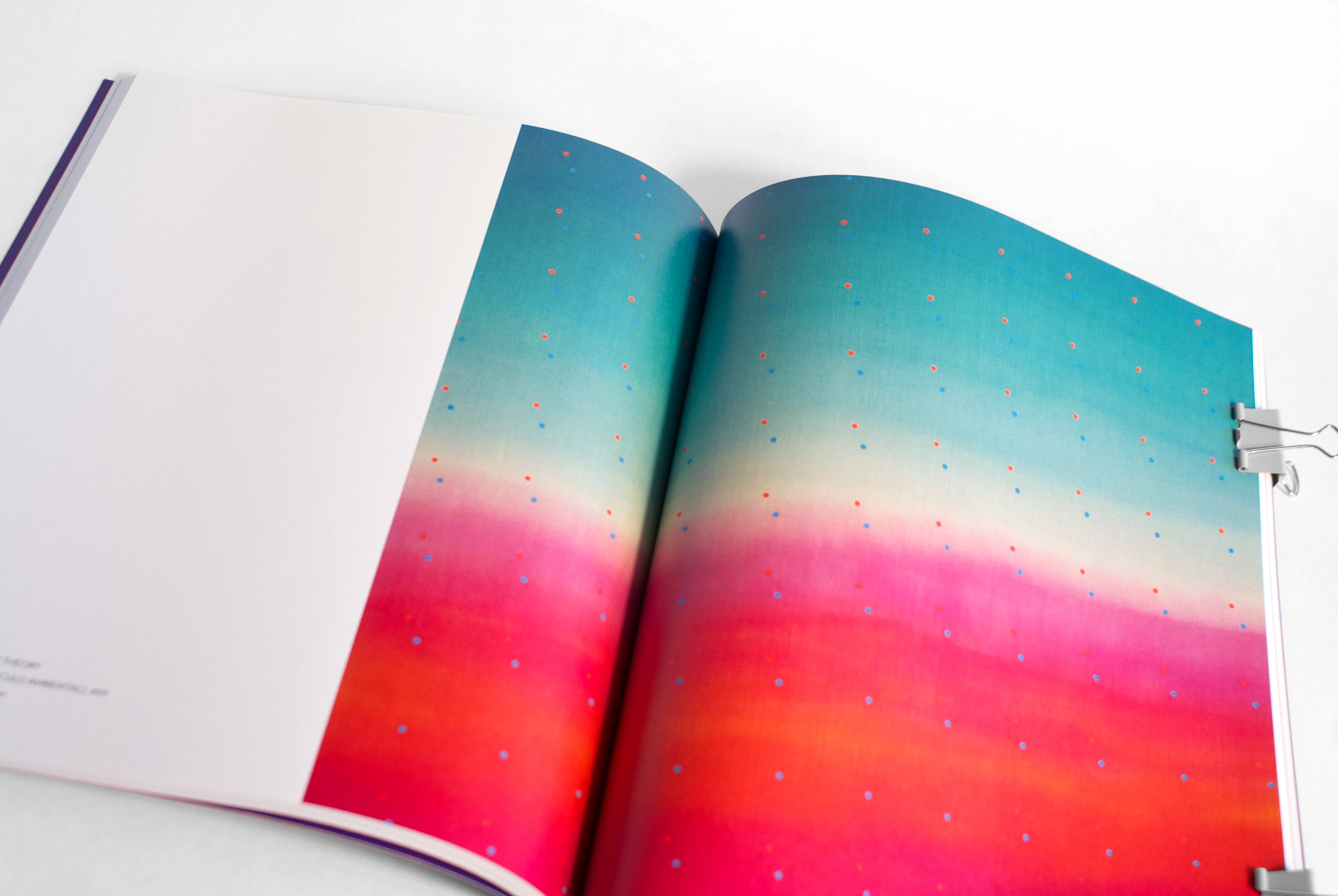
Diacritics
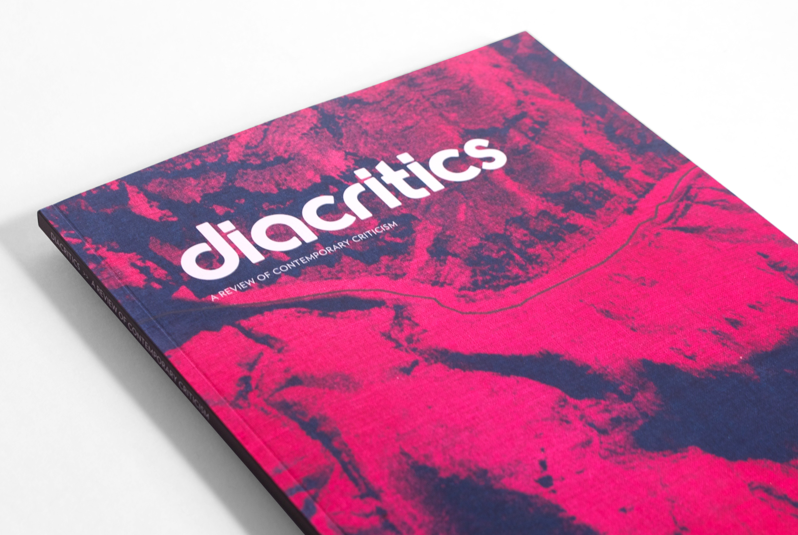
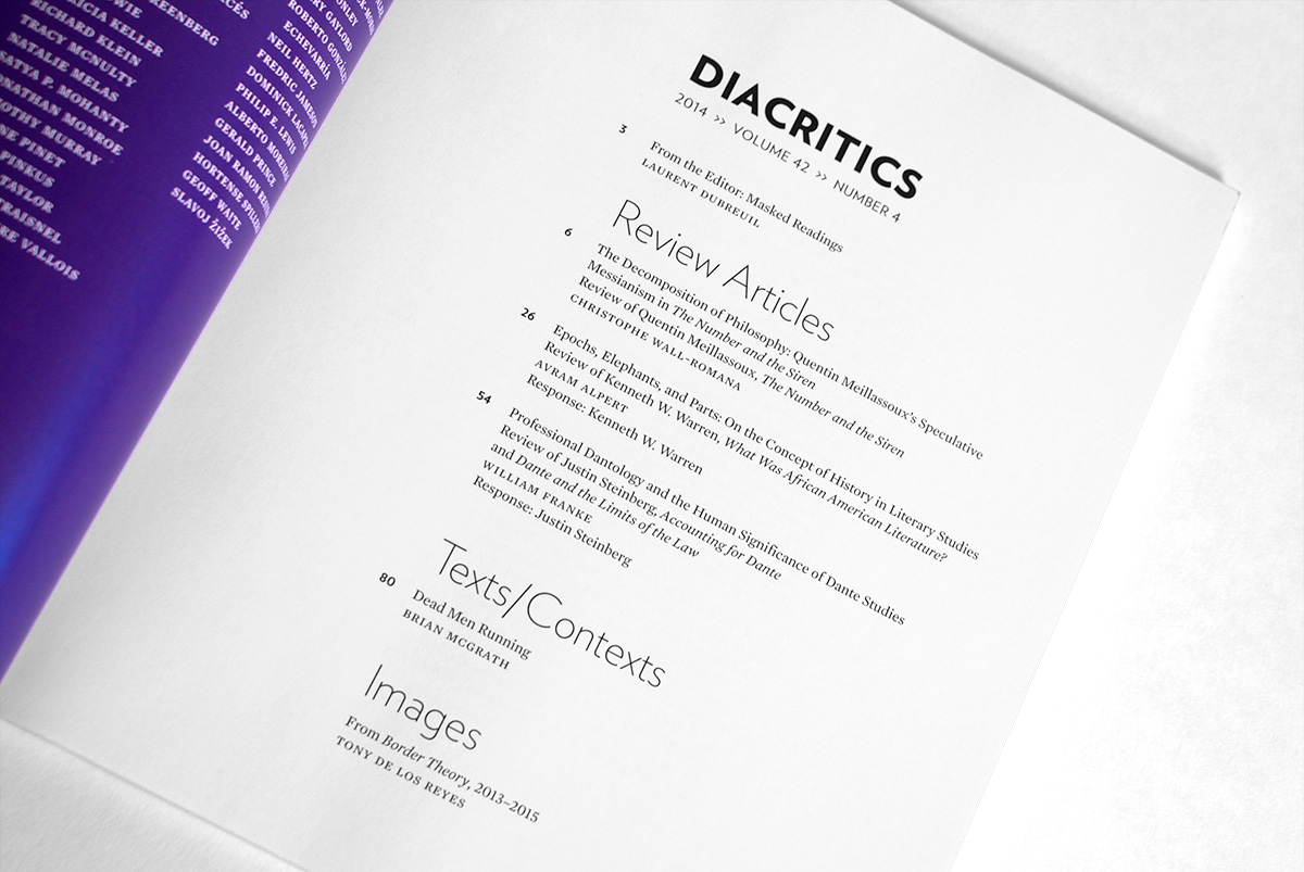
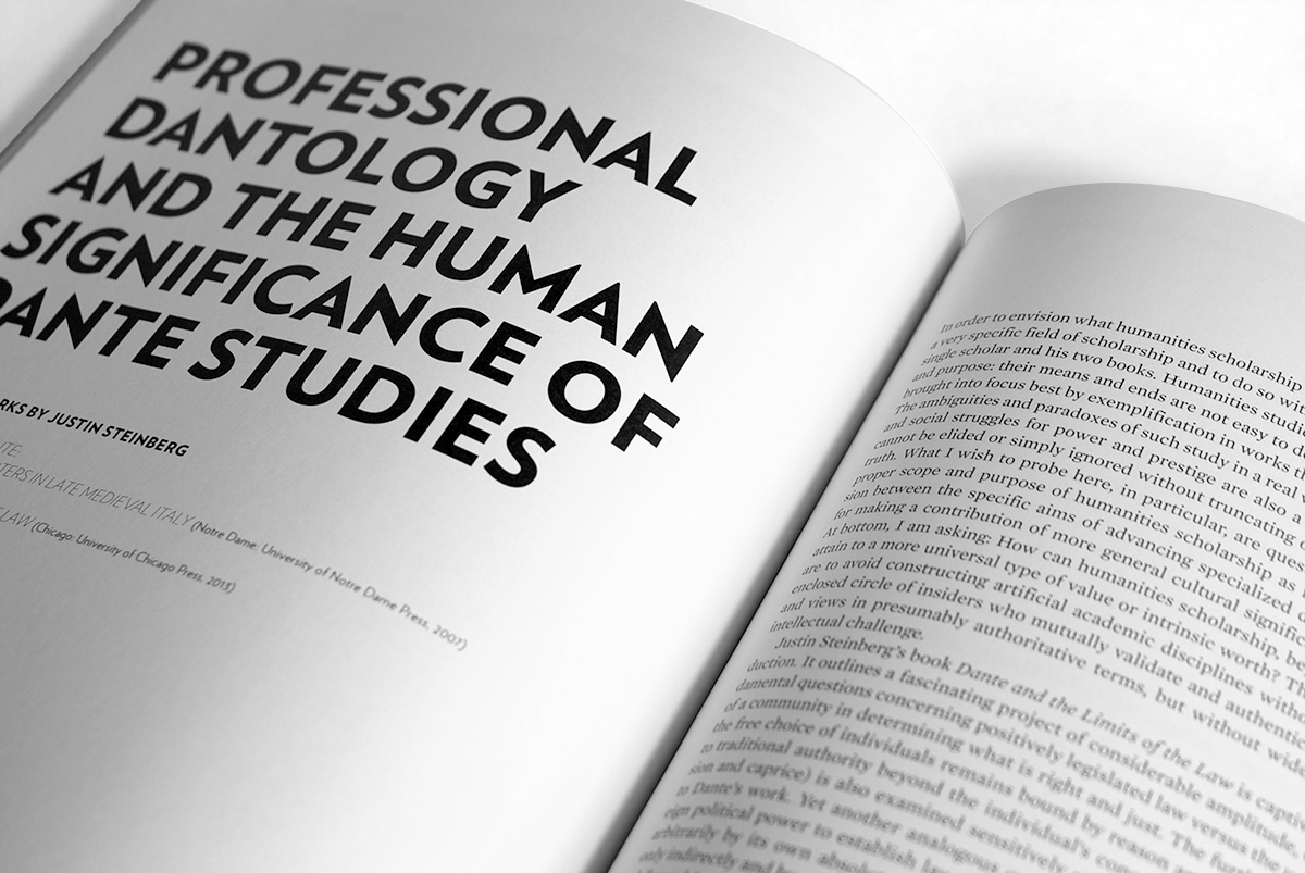
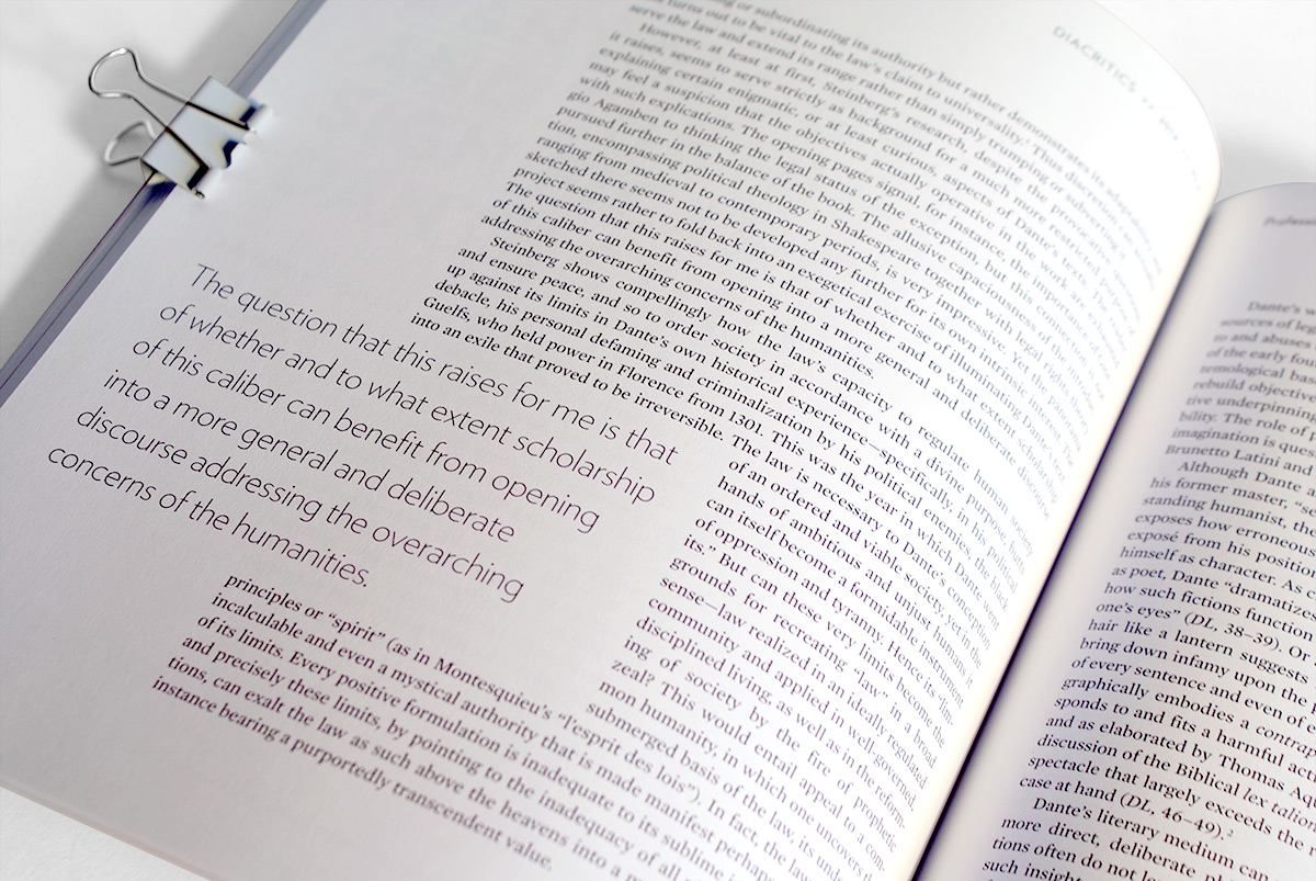
Upon reaching its 40th year of publication, Diacritics, a quarterly “review of contemporary criticism” by Cornell University, felt they needed a more contemporary design. As they say “style is cyclical”, so we dusted off the incredible logotype from the very first issue in 1971 and paired it with type from Hoefler & Co. and a clean, modern layout that is as bold as the essays in each issue. Following the initial redesign, I typeset and produced print-ready files for 13 issues.Cornell University — created with Rick Rawlins/co
