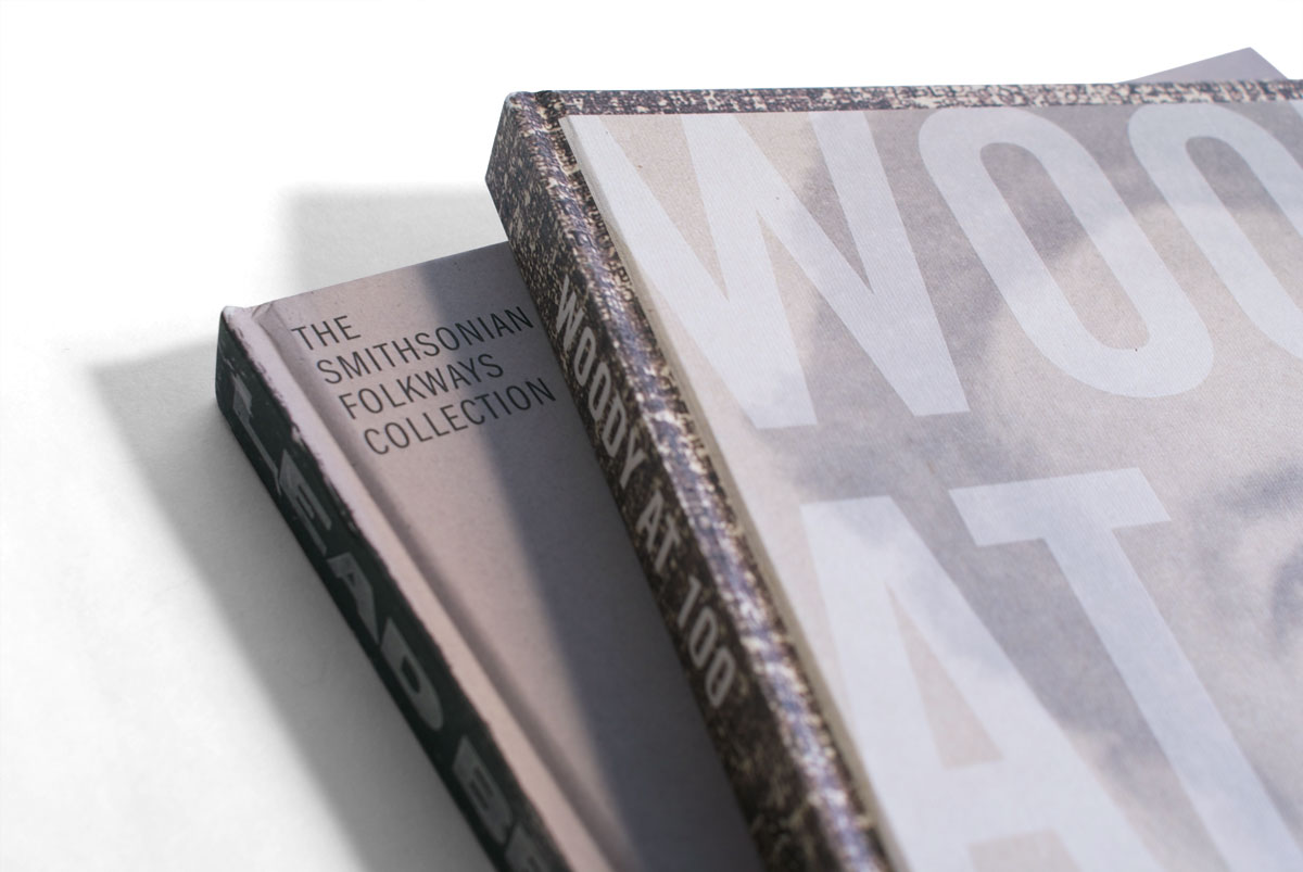
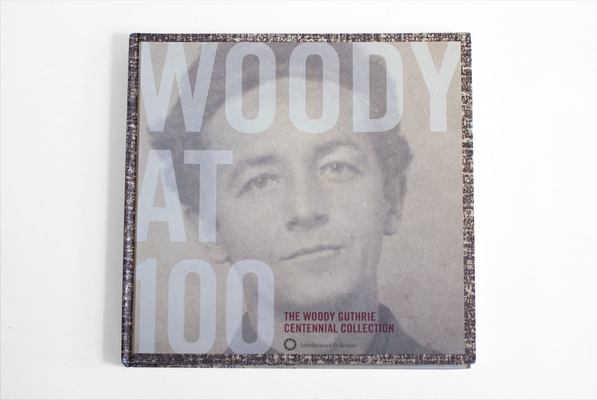
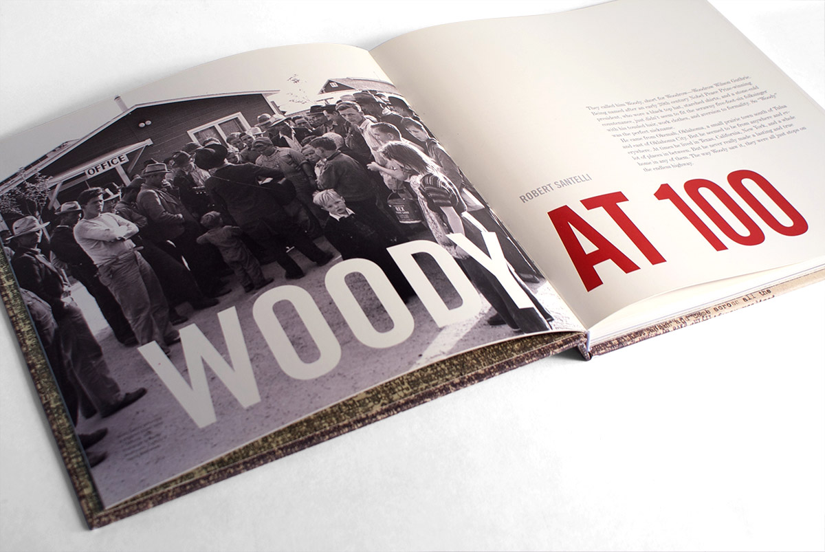
We wanted the packaging to resemble the record covers of the era,
specifically those of other Folkways Records albums, and to stand out on
the shelves so we went for a 12" by 12" format with huge typography and a
life size (and never-before-seen) photo of Woody Guthrie’s face.
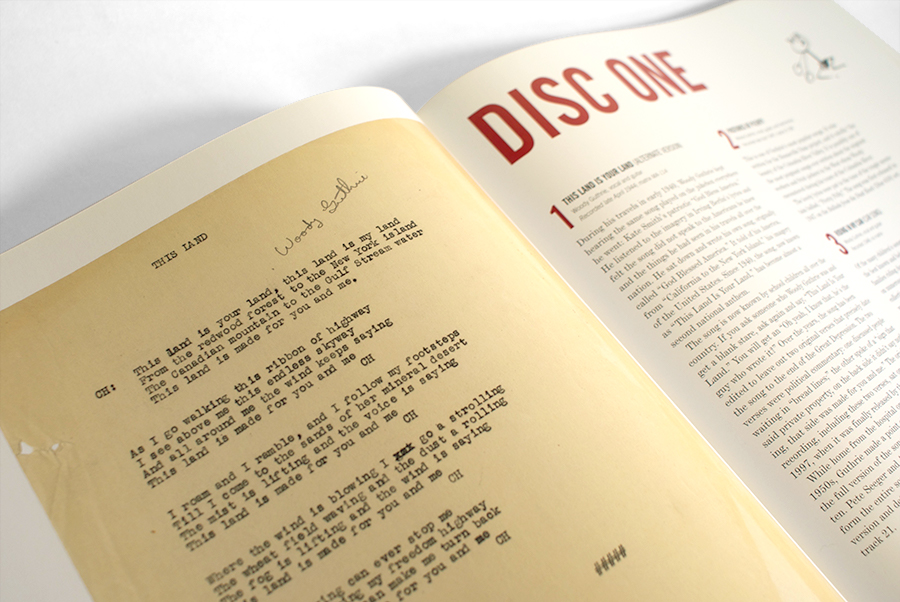
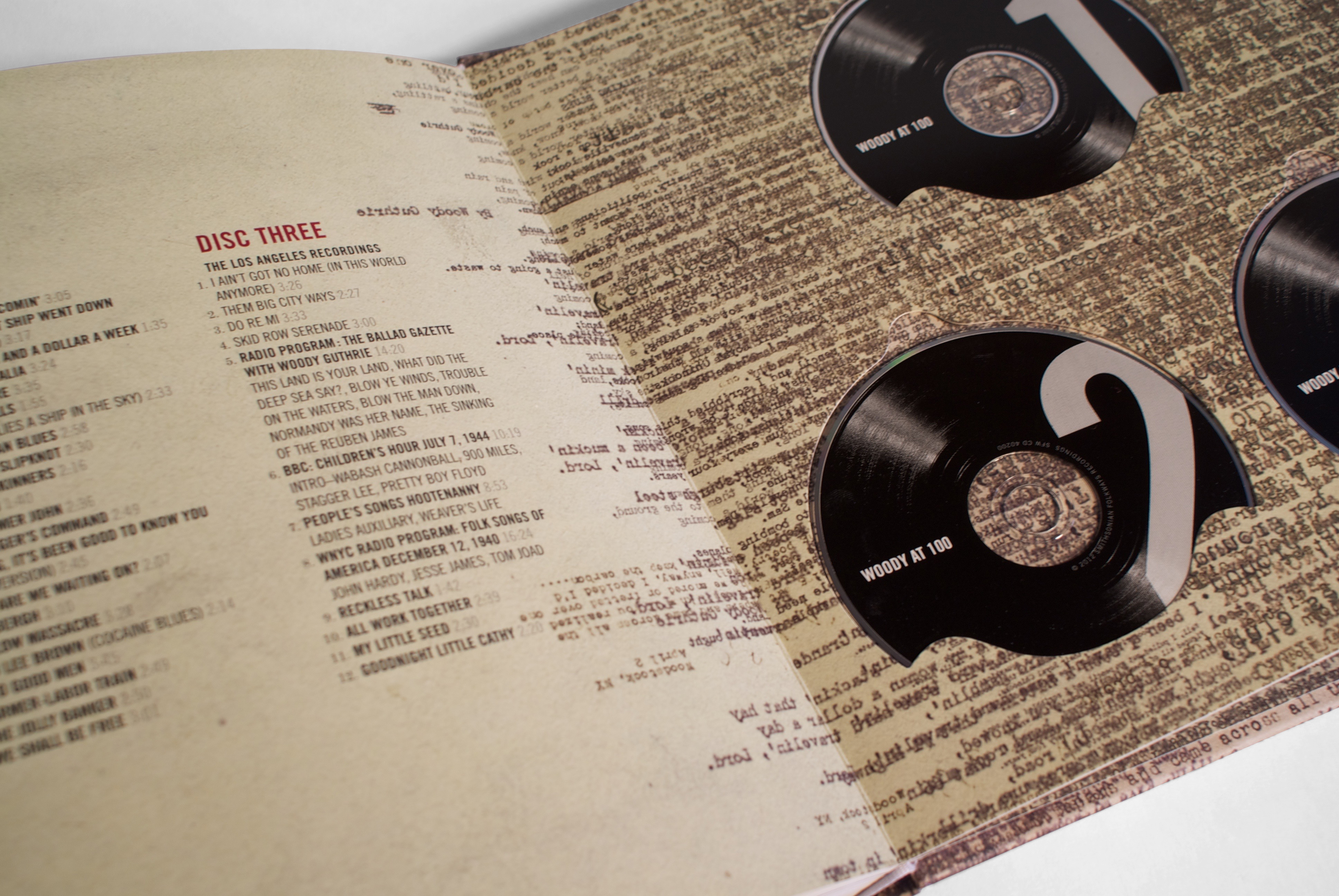
Guthrie typed out the lyrics to all of his songs on his typewriter, sometimes
many variations on the same song. We grabbed a bunch of these from the archive
and layered them to create the texture along the edge of the cover, binding,
and a handful of interior pages.
We were able to match up some of the typewritten lyrics with the listed
tracks on each page. We also made the CDs look like little records (cute),
brought back the lyric texture mentioned earlier and included Guthrie’s
doodles in the margins of the pages.
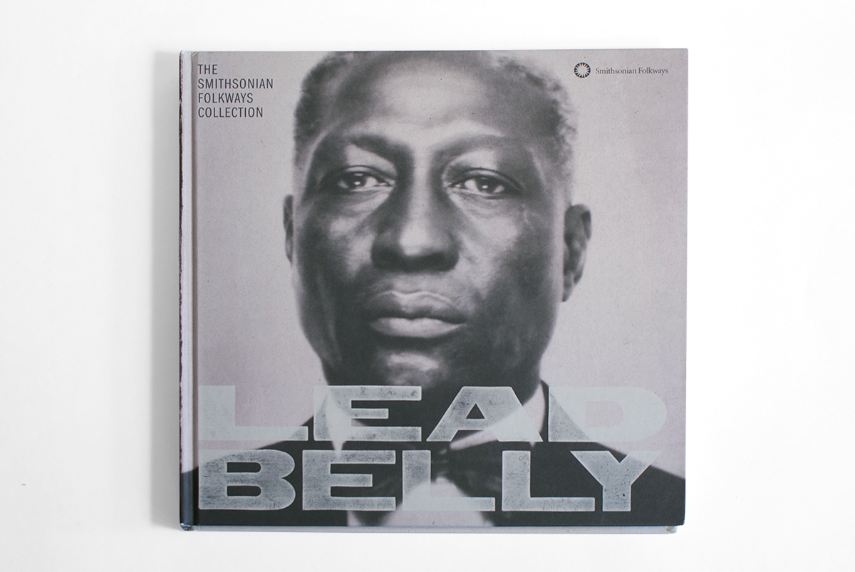
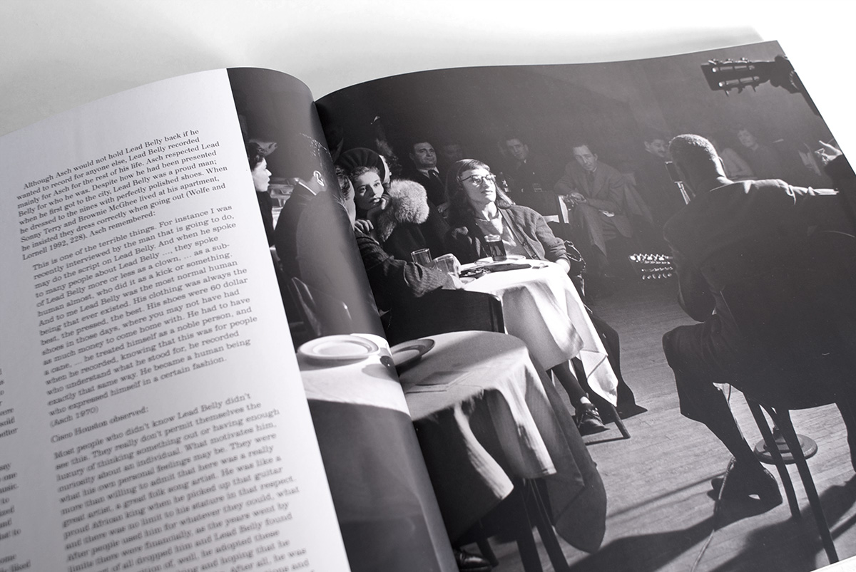
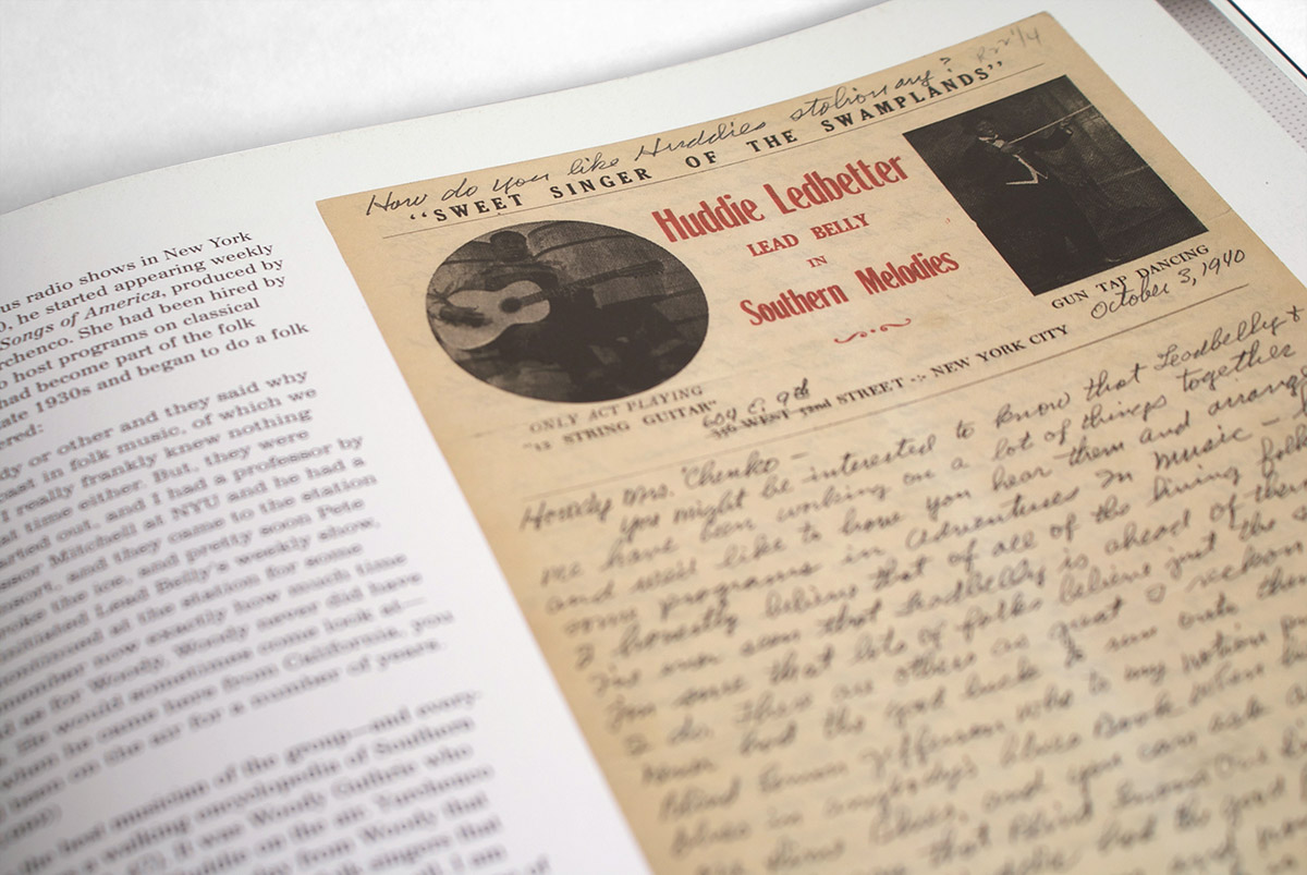
Following the success of Woody at 100 we created the second installment
of the series, Lead Belly: The Smithsonian Folkways Collection. We
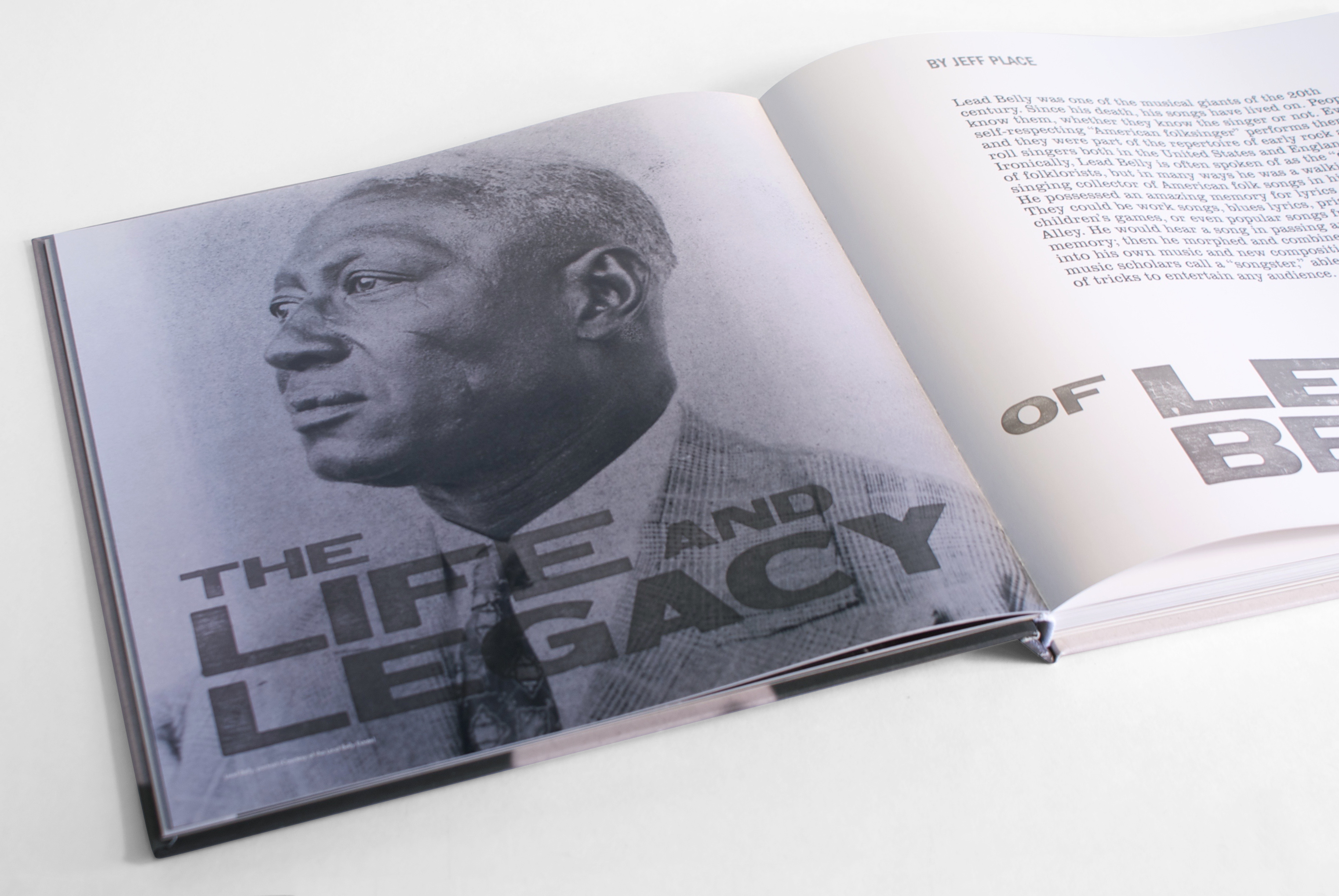
kept the format the same but tried to bring in some of Lead Belly’s vibe.
We went with a similar photo treatment on the cover and set the title in
some rough wood type.
